There are many ways to look at investor sentiment, one of my favorite is looking at flows to mutual funds and ETFs. The Investment Company Institute (ICI) compiles all of this data. You can find the mutual fund flows from ICI here, but for the ETF flows my friend @NickatFP hooked me up with that data. Nick shares more cool charts than just about anyone, follow him if you don’t already.
Getting to it, one consistent theme the past eight years has been money leaving mutual funds and moving into ETFs. Pick a reason why, mine is there is still a major distrust of Wall Street and investors would rather do it themselves. Not to mention the majority of mutual funds underperform their benchmarks, while also charging some outrageous fees. A cheap ETF is a nice alternative. And we are seeing this show up in the fund flows data.
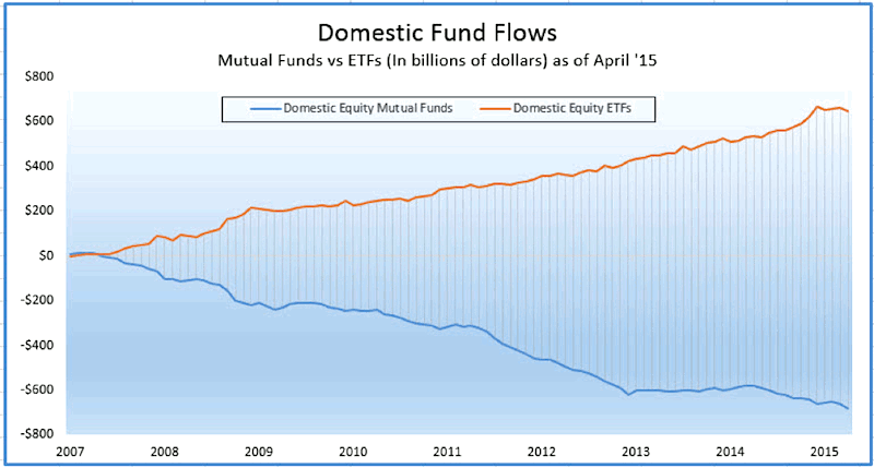
Here’s a chart I love to share that shows the major change in attitudes between mutual fund flows and ETFs flows. Since 2007, $680 billion have left domestic equity mutual funds, while $646 billion have flowed into domestic ETFs. So nearly every dollar that leaves a domestic mutual fund goes into a domestic ETF. How about that?
Thanks to the data Nick got me, I was able to create this great chart. There was an enormous flow into domestic ETFs in December. In fact, more than $45 billion moved into this area. This was on top of the $30 billion inflows in November. What really stood out to me was this December was the second most flows ever, only to September 2008. That of course was right in the midst of the start of the financial crisis, with the S&P 500 eventually dropping more than 50% eventually.
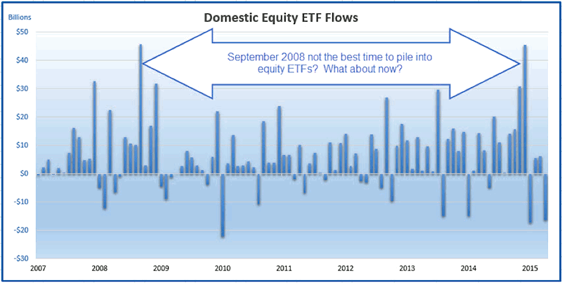
Fast forward to right now. After seeing 10% gains in the S&P 500 for three straight years, investors all of a sudden couldn’t get enough domestic equity ETFs to end last year. Now five months later, this is the worst start to a year in the 3rd year of the Presidential Cycle going back to 1950. Coincidence? Andy Nyquist wrote about this weakness last month. Bigger picture, was December a huge warning of underperformance for US markets? Putting my 20/20 hindsight glasses on, I sure think so. Still, flat five months later is a lot better than the five months after September 2008 I guess.
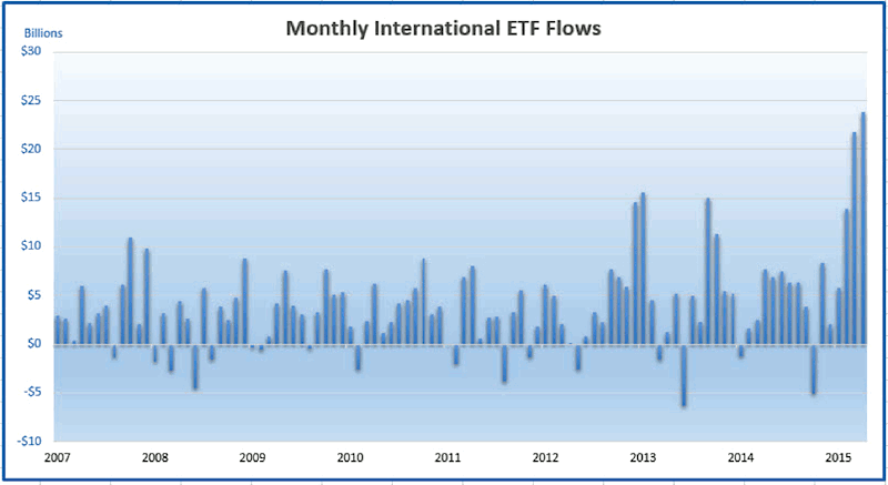
What about now? Well, Europe and Asian markets have trounced the US returns this year. And wouldn’t you know it, investors have noticed. A record $21 billion flowed into International ETFs in March and another cool $23 billion in April. In fact, the first four months of this year saw $65 billion inflows, well above the previous record of $36 billion in late 2013. The question I’m asking myself here is are investors once again late to the party?
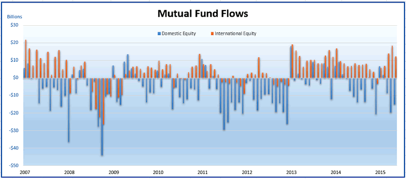
So ETFs are flowing into International funds, what about mutual funds? As you can see below, we’ve seen steady inflows so far this year to International funds, while continued outflows to domestic mutual funds. More of the same is what I’d say.
Be sure to let me know what you think all of this might mean. My take is US markets are a choppy mess and I can’t get a good read, but the bull market isn’t broken yet. My bigger concern is that investors are getting very excited about International funds here, just at the wrong time. With the German DAX breaking down and officially correcting 10%, my worry is this weakness could very well continue.
Thanks for reading and good luck out there.
Twitter: @RyanDetrick
No position in any of the mentioned securities at the time of publication. Any opinions expressed herein are solely those of the author, and do not in any way represent the views or opinions of any other person or entity.
 Rolling Over At Key Fibonacci Level?")


 Rolling Over At Key Fibonacci Level?")


